Sweating the Small Stuff: Recreating Subtle Design Details Using Sass
timhettler.github.io/sweating-small-stuff/
.dark-button {
  @extend %button;
  @include contrasted(#983168, #333, #fff);
}

.light-button {
  @extend %button;
  @include contrasted(#ffd204, #333, #fff);
}
.dark-button {
…
background-color: #983168;
color: #fff;
}
.light-button {
…
background-color: #ffd204;
color: #333;
}.dark-button {
…
@include yiq-contrasted(#fa5400);
&:hover {
background-color: adjust-color(#fa5400, $lightness: 5);
}
}
.light-button {
…
@include yiq-contrasted(#87e300);
&:hover {
background-color: adjust-color(#87e300, $lightness: -5);
}
}
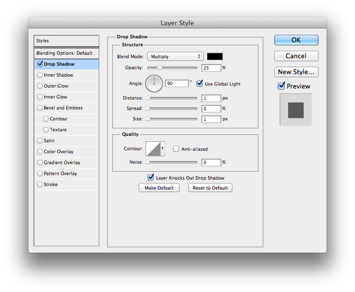
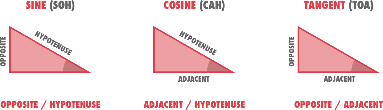
$x-offset: round( cos( $angle ) * $distance )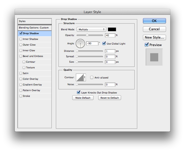
$y-offset: round( sin( $angle ) * $distance ).button {
…
box-shadow: photoshop-drop-shadow(
90deg, 1px, 0, 1px, rgba( #000, 0.25 )
);
&:active {
box-shadow: photoshop-inner-shadow(
90deg, 1px, 0, 4px, rgba( #000, 0.35 )
);
}
}.button {
…
text-shadow: photoshop-text-shadow(
-90deg, 1px, 0, 0, rgba( #000, 0.4 )
);
&:active {
text-shadow: photoshop-text-shadow(
90deg, 1px, 0, 0, rgba( #000, 0.4 )
);
}
}
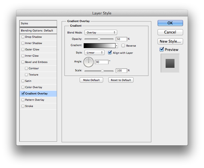
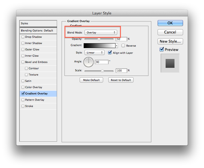
.simple-gradient {
@include background-image(
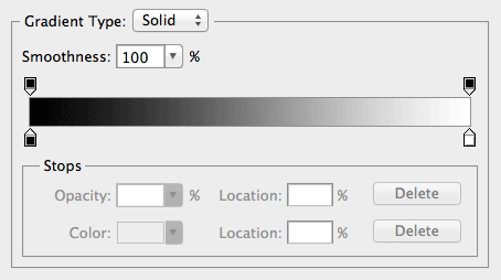
photoshop-gradient-overlay(
100%, 90deg, 100%, ( #000 0% , #fff 100% )
)
);
}.simple-gradient {
background-image: linear-gradient(0deg, #000 0%, #FFF 100%);
…
}
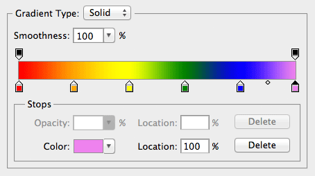
.complex-gradient {
  @include background-image(
    photoshop-gradient-overlay(
      75%, 0deg, 50%, ( red 0%, orange 20%, yellow 40%, green 60%, blue 80%, violet 100% )
    )
  );
}
.complex-gradient {
background-image: linear-gradient(30deg, rgba(255, 0, 0, 0.75) 25%, rgba(255, 165, 0, 0.75) 35%, rgba(255, 255, 0, 0.75) 45%, rgba(0, 128, 0, 0.75) 55.0%, rgba(0, 0, 255, 0.75) 65%, rgba(238, 130, 238, 0.75) 75%);
…
}
.button {
  …
  @include background-image(
    photoshop-gradient-overlay(
      50%, 90deg, 100%, ( #000 0% , #fff 100% )
    )
  );

  &:hover {
    @include background-image(
      photoshop-gradient-overlay(
        50%, 90deg, 100%, ( #000 0% , #fff 100% )
      )
    );
  }
}